
1. Visualizations.
An analysis consists of visualizations based on the loaded data. To provide the best representation of your data, many visualization types are available. Within each visualization type, you can use various properties to reflect different dimensions of the data, for example, color, size, and shape.
2. Pages
The visualizations are organized onto pages in the analysis. You can resize and move around the visualizations on the pages to get the desired layout when creating an analysis.
A page can also contain text areas (added using the installed client). There you can add information, static as well as dynamic, and also initiate various kinds of interactions like filtering or switching to another analysis page.
3. Authoring bar
If you have authoring permissions, you access the most frequently used features for authors by clicking the icons on the authoring bar. If the authoring bar is unavailable, switch from Viewing mode to Editing mode in the top right corner of the menu bar, see below.
-
Files and data : Here you add the data you want to visualize, or open existing analyses.
-
Data in analysis : Lets you create visualizations by selecting the data you are interested in first, and then you let Cloudfire recommend various ways to visualize it. This is also where you can get more information about the data and filter out values.
-
Visualization types : Here you create visualizations by selecting the type of visualization you want to use. Then you configure the visualization your way.
-
f(x) – analytic tools : If enabled, gives you easy access to your favorite data functions, which can perform different calculations. In the installed client, you can also reach analytic tools from here.
-
Actions : Here you get an overview of the action mods and external actions in your analysis. You can run an action from the flyout, and edit its configuration.
-
Data canvas : Here you get a view of the data structure in the analysis, and you can also make changes to it. You can, for example, add more rows and columns to data tables, transform the data (installed client only), and specify when and how the data should be loaded and stored.
4. Menu bar/options
In the left part on the menu bar, features mentioned in the authoring bar section above are accessible, but you can also get access to other important features, for example, export and calculation options, as well as the user guide. In addition to the menus, buttons for Undo and Redo are available.
If you want, you can click the three dots furthest to the left to show or hide this part of the menu.
To the right on the menu bar, you can use Find as a short way to find contents as well as actions and features you are looking for. This part of the toolbar is also where you are given information, various notifications, and scheduled updates details, and you can open the collaboration, bookmarks, and filters panels, and settings for the visualization properties. You can customize this part of the toolbar by selecting shortcuts to actions and tools that you use often.
If you are authoring analyses to be consumed by users who do not have authoring rights, you get their view of the analysis by switching from Editing to Viewing in the drop-down list.
5. Status bar/options
The status bar is located at the bottom or the top of the window and shows information about the main data table used by the active visualization (the visualization that was last clicked upon). If the information is not visible, click .
This is Cloudfire
Do you want to do ad-hoc analytics, perform in-depth exploration of data, or create informative, up-to-date dashboards? Then Cloudfire® is the tool. In this guide, you learn what Cloudfire is, and how to get the most out of it. You will find what you can do to gain insights about your data, and how to do it in detail, all supplemented with examples that serve as a source of inspiration.
.png)
01
Multi-experience solutions
Read on to understand how to get the data into an analysis, and how you can visualize and interact with the data to answer the questions you might have. Interactions can involve anything from filtering to data of interest, drilling down to more detailed levels, performing calculations on the data, or applying statistical methods.
02
Interface assist
The Cloudfire user interface assists you in analyzing the data by providing recommendations on visualizations that fit the data you want to display. You can also get assistance in discovering relationships in the data, or how to add new data in good ways. Recommendations and tips are indicated using a light bulb icon.
Load data
The most important thing when working with Cloudfire is your data. All data is accessed by clicking Files and data on the authoring bar.
If you are a consumer user you will only have access to predefined analysis files, whereas author users can access data from multiple different sources. You reach all the different ways to add data via the Files and data flyout (reached by clicking + on the authoring bar).

Visualize data.
To represent the data visually, many different types of visualizations are provided, all with different strengths for displaying the data in an informative way.
For example, there are visualizations suitable for making comparisons and investigating distributions, correlations or trends in the data as exemplified below. Whether the data is continuous or categorical, if it should be aggregated, and whether one, two, or more variables need to be represented, are also of importance when deciding which visualization to use.

When you add a visualization to an analysis, you can do it in three ways:
-
Start from the data
By selecting data columns you are interested in among the loaded data, you will get recommendations on visualizations based on these particular columns. Then, the visualization of interest can simply be dragged to the analysis page, and if needed, you can fine-tune it there.
-
When using the installed client, beyond basic visualizations based on selections, you might also get visualizations recommended to you based on insights calculated by the recommendations engine. Such an insight could be that another, not selected data column, has a strong correlation to any of your selected columns.
-
Start from a visualization type
You can simply select the visualization type you want to use, and drag it to the analysis page. Once on the page, you can select which data columns you want to visualize, and how. This way you build the visualization from scratch.
-
Search for what you want to visualize
You can search for data you are interested in among existing content and also get recommendations on new visualizations that can be relevant. The visualizations can then be dragged to the analysis page.
No matter method used, you can at anytime modify the properties of the visualization. The properties to change can be anything from changing what data columns are visualized, changing the aggregation method used to summarize the data, to changing colors and fonts. You can even switch to another visualization type.
Get started
To add a visualization, do one of the following:
-
Click Data in analysis on the authoring bar, and in the opened flyout, select the data columns you are interested in. Among the visualizations that are recommended, click or drag the one you are interested in to the analysis, and explore it.

Click Visualization types on the authoring bar, and from the opened flyout, click or drag the visualization type you want to use to the analysis page. Then modify the default settings to make the visualization look the way you like.


Options / Find
Click Find on the menu bar. In the opened search field, type what you want to visualize, and let us suggest visualizations for the matches found. For example, if you type the names of data columns you want to explore, visualizations are suggested as shown in the image below. Then click or drag the one you are interested in to the analysis, and explore it.
The Find tool is a fast way to find contents in your data. It consists of a text field where you enter a search string and a list of results for the search.
Example
In the analysis below, there are three pages (Furniture sales, Garden sales, and Toys sales), and a data column named Toys. If you enter Toys as search criterion, you get visualizations based on the Toys column recommended to you, which you can add to the analysis through a simple click.

To access the tool, click Find on the menu bar, or Ctrl+F.
You can enter search criteria to find, for example,
-
actions that you want to perform
-
pages and visualizations in your analysis
-
certain data values for marking purposes
-
library items that you want to open.
Last, but not least, you can
-
enter data column names and get visualizations recommended to you.
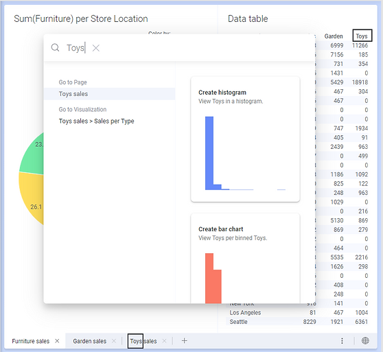
Moreover, the search gives that a page includes Toys in its page title, and lists also the visualizations on that page. Simply click any of the listed items to access it.
Tip: Additional examples of what can be entered in the search field are:
-
y:sales will list all visualizations with Sales on the y-axis.
-
sales category:page will only list all pages with "sales" in the title.